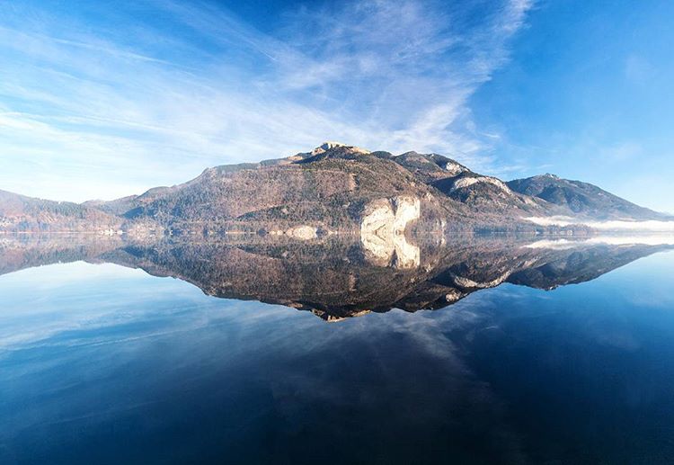
Earth is also known as The Blue Planet. And for good reason. The skies and the seas are the canvas upon where we rest our lands, the perfect hue that tells a different story, when paired with a different shade. The colour is in abundance, but the tones are tricky to get right, as light alters the quality of this hue.
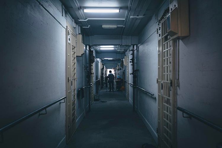
But if blue was an emotion, it usually reminds us of things not as pleasant. Monday Blues is a term oft-used these days by the suited and desk-bound, and the range of sorrow, loneliness and moodiness can be conveyed with this colour. When paired with neutrals, one can create a cold, evocative environment.
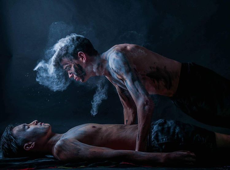
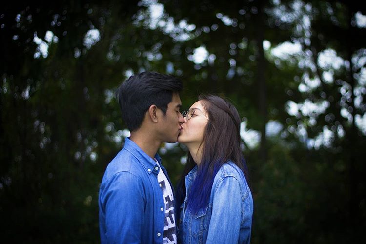
Even as it represents solitude, blue is a colour that also communicates. The mysterious colour is full of magic, and can convey conversation, thoughts and expression. The hue can signify a meaningful exchange beyond boundaries, when brought into the composition between subjects. Use it to signify that bond and make your story flow.
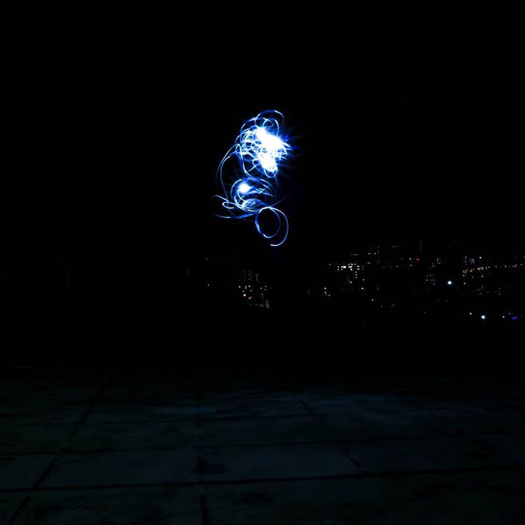
Blue is an electric colour. It powers wonder and speed. It jumps and startles. With electric lights moving into the cooler shade, as LED lights become the norm, it’s a shade that illuminates as well. Light play is common for this shade as night comes on, fitting for the cooler environment.
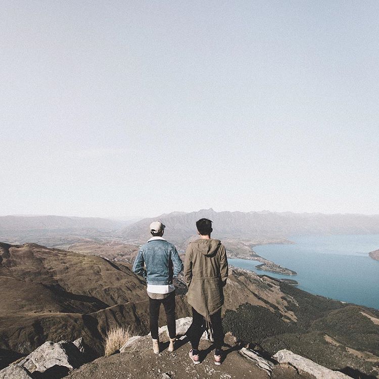
Blue also clothes us – denim being one of the most popular textiles in the world. The familiar shade of blue is comforting, sturdy and reliable. No matter where you go, denim blue is recognised. It is a colour that speaks to the universal appeal in the fashion industry.
The colour continues through different cultures. It is one that is easily achieved through nature, and blue dyes have often been created and used for its beautiful properties. It can be regal or common, vibrant or peaceful. And definitely, timeless.

One of today’s most common pairing in movies, blue and orange are complementary in the colour wheel. The conflicting hues present an oddly pleasing palette, that can work equally well even in still photography. It mimics the warm tones from the sun receding, as the cooler ones take over, bringing with it night and space.
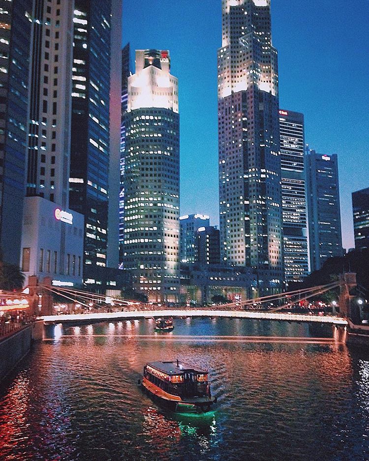
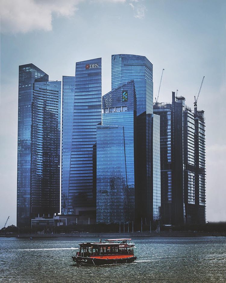
With all the glass and steel that we are using these days in architecture, blue has become dominant in cityscapes. Towering buildings reflect their environment, translating nature’s colour into a language of modernity and development.
For instagram-worthy pictures, toning down the shade to a milky blue, and pairing them with cold greys or greenish browns, is a perfect palette formula to achieve hipster validation. The “Kinfolk” colours have been applied from interiors to landscapes to great appeal.
Blue is often said to be a safe colour. But when one explores the shade, the way it speaks can be altered to the circumstance, bringing about deeper meaning and nuanced result. Teal, turquoise, pastel or cobalt; blue remains an adaptable spokesperson in the spectrum.
First published: Canon EOS World
